
Showing posts with label landscape. Show all posts
Showing posts with label landscape. Show all posts
Tuesday, September 30, 2014
The Dune
I painted 98% of this painting a few weeks ago and had been meaning to fix a portion of the sky. I finally got around to it and it only took two minutes. I have no idea why I procrastinated so long, but I am glad that I finally finished it as I am happy with the result.
Monday, September 29, 2014
Clouds over Kiawah
A high school buddy of mine has a place on Kiawah Island and said I could use her photo of a marsh as a reference. I toned the paper with orange and allowed some of that to peek through. Still using the oil paper but I computer it down to 8 1/2 x 11. I know that isn't a standard size for paintings, but I accidentally bought some diploma frames (nonreturnable at this stage) and thought the oil paper paintings would fit in them perfectly. I am still using a palette knife, too.
8 1/2 x 11
Oil on Arches Oil Paper

Saturday, September 13, 2014
Santa Monica Sunset
I've never had that much success with sunsets. I always end up wiping them down, so I went a little semi-abstract with this one. Block in was done with a large brush, and the rest was structured with a palette knife. This is also bigger than usual and I really enjoyed it.
Oil on Board
18x24

Oil on Board
18x24

Thursday, September 11, 2014
"Tree on Right"
I have to do something about these titles. Semi-abstract tree. This is just a study of a portion of a future large painting I intend to paint ... eventually.
I am a fan of this French artist Alexandre Monestier. You can see his work here: http://www.atelier-monestier.sitew.com/. His father, Pascal Etchenic, is also a painter, and some of his work can be seen here: http://www.galeriedecannes.com/gallery/artist_detail.php?artisteID=3.
When I first started painting (and not knowing anything about working with oil paints), I made some attempts to mimic their style. It didn't work out very well. Trust me. However, I like this little semi-abstract tree. I intend to paint a large landscape or seascape with flattened out colors as Monestier paints.
I think I had to learn to "construct" before I learned how to "deconstruct".
Wednesday, September 10, 2014
"Sunny Forest Floor"
I've never painted a scene anything remotely like this. Initially I was intimidated, but it wasn't that difficult, actually. Partially painted with a palette knife and partially with a brush. Partially painted yesterday and partially painted today. I'm partial to this painting. :-)
6x6
Oil on Board

6x6
Oil on Board
Monday, August 11, 2014
The Most Beautiful Village in Provence
Oops! I forgot the picture when I first posted this! Roussillon was one of the most beautiful villages in Provence. On our tour through Provence, our lovely guide, Virginia explained that there were quite a few villages boasting to be "The Most Beautiful Village in Provence". I, for one, could not choose. They are all beautiful in so many different ways. Roussillon is very unique with its ochre cliffs. I painted this scene before in pastels, and thought I would give it a shot in oils and with a palette knife. I'm pretty happy with this ... well ... except for that stupid shadow from my easel that I didn't edit out! Doh!
I titled this one Ochre Naturel (spelled the French way since this is from Provence)
 Ochre Naturel
5x7
Oil on Board
I titled this one Ochre Naturel (spelled the French way since this is from Provence)
5x7
Oil on Board
Sunday, April 13, 2014
Sedona Peaks
I've been going back through my studies and I have been slacking on the posting! From my photo reference.

Monday, February 24, 2014
Five Of A Kind - Karen Margulis' online class (week two)
I chose to paint small 5x7 studies of the same landscape: (a) all cool colors, (b) all warm colors, (c) monochromatic, and (d) random colors. I wasn't sure if I did the assignment correctly or not (hence my delay in posting), but my feedback was great, so here they are.
My favorite was the green one.


My favorite was the green one.
Monday, January 20, 2014
Idyllic Seclusion
Another one from the island of Capri. In addition to visiting the famous Blue Grotto, we took a tour around the entire island of Capri in 2011 when we visited. It was a pleasant surprise because I had no idea that was included. Pastels lend themselves to the craggy rocks and colorful eroded areas. I exaggerate the colors in Photoshop or Paintshop Pro, and use my Oil Painting app to blur.

Sunday, January 12, 2014
Frame Builder
Today I discovered an awesome app called Frame Builder. After seeing eBay artists display their art for sale in a virtual frame, I went on a quest to find a way to do the same. It's a great tool that allows potential buyers (and the artist selling his/her art) to visualize their potential sale in a frame or even just a mat. You can easily change the size or color of the frame or mat just by dragging a slider bar. You can even change the size of the bevel on the mat!
Take this painting I did over the weekend. I like the way it looked in person and even with a simple white mat over it, but the image alone? Not so much.

Enter Frame Builder, et voilà! Much better!

A couple of other examples:


Additionally, you can save "templates" so that you don't have to start from scratch. Coolio!
Monday, December 30, 2013
Pink Callanques
I tried to paint this scene in oils not long after I returned from Marseille in July. I was a bit rusty as I had not painted for a while, wasn't happy and thus put it away. Here it is on my largest pastel to date: 8x10. 98% of the pastels I used were Terry Ludwig pastels with a sprinkling of some very soft Scminckes for some finishing touches in blue? I followed Karen Margulis' recommendation for doing an under painting with a dark blue hard pastel (Nupastel) and mineral spirits. The support is Ampersand Pastelboard. I'm happy with this one!

Friday, December 27, 2013
A Pastel Adventure
I recently bought a set of Terry Ludwig pastels. It is quite different than oils so it takes some getting used to. That being said, I'm really enjoying the medium! I have discovered some amazing pastelists: Karen Margulis, Marla Baggetta and Casey Klahn to just name a few. I hope to study with each and everyone of them soon!
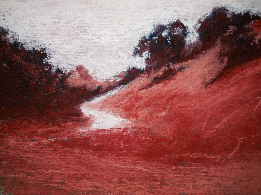
My first painting that I was satisfied with enough to post is "Capri Cove", a scene I have painted before in ACEOs. "Ojai Path in Blue" is from a reference photo I took in Meditation Mount in Ojai, California from my first painting workshop with Elio Camacho. "Variation" is an exercise (idea originating from Marla Baggetta's "100 Variations" using the contrasting colors of the red trees with the cool green in the foreground only allowing myself 30 minutes to paint. It's a very good exercise, one which I intend to continue doing.
CAPRI COVE

OJAI PATH IN BLUE

VARIATION

Monday, January 7, 2013
ACEO - Capri Grotto Cliff (acrylic)
I really had fun with these last two from my vacation photos in Italy.
I take the photo and bump up the saturation in Photoshop or Paint Shop Pro, blur it out a bit.
Another good thing about ACEOs is that they provide a good study for a future big painting.
This one, for instance is a definite possibility.

I take the photo and bump up the saturation in Photoshop or Paint Shop Pro, blur it out a bit.
Another good thing about ACEOs is that they provide a good study for a future big painting.
This one, for instance is a definite possibility.

ACEO - Return to Oils - Antelope Valley Tree -- SOLD
I was having so much fun with the acrylics that I decided I could do the same with oils using the Fabriano Tela Oil Paper. The scanner still picks up the texture of the Tela paper, but not quite as much as the canvas paper on some of the earlier ACEOs.
LONE TREE, ANTELOPE VALLEY, CA - Oil on Fabriano Tela Oil Paper

LONE TREE, ANTELOPE VALLEY, CA - Oil on Fabriano Tela Oil Paper

ACEO Bush Lupine - SOLD
I really enjoyed painting this one.
I reintroduced Phthalo Green to my palette, and am quite glad I did!
Phthalo Green with Quinacridone Red and a bit of Phthalo Blue with a titch of white make a gorgeous gray which is used sporadically in the bush.
BUSH LUPINE, ANTELOPE VALLEY, CA - Acrylic on Canvas Paper

I reintroduced Phthalo Green to my palette, and am quite glad I did!
Phthalo Green with Quinacridone Red and a bit of Phthalo Blue with a titch of white make a gorgeous gray which is used sporadically in the bush.
BUSH LUPINE, ANTELOPE VALLEY, CA - Acrylic on Canvas Paper

ACEO - Ojai Path -- SOLD
Here was my 2nd ACEO acrylic landscape which has already been sold on eBay.

In 2011, I attended a workshop with Elio Camacho and painted this scene.
This was my second round with the same scene.

Subscribe to:
Posts (Atom)