Showing posts with label daily painter. Show all posts

Monday, September 29, 2014

Clouds over Kiawah

A high school buddy of mine has a place on Kiawah Island and said I could use her photo of a marsh as a reference. I toned the paper with orange and allowed some of that to peek through. Still using the oil paper but I computer it down to 8 1/2 x 11. I know that isn't a standard size for paintings, but I accidentally bought some diploma frames (nonreturnable at this stage) and thought the oil paper paintings would fit in them perfectly. I am still using a palette knife, too.

8 1/2 x 11

Oil on Arches Oil Paper


Sunday, September 28, 2014

Through Here

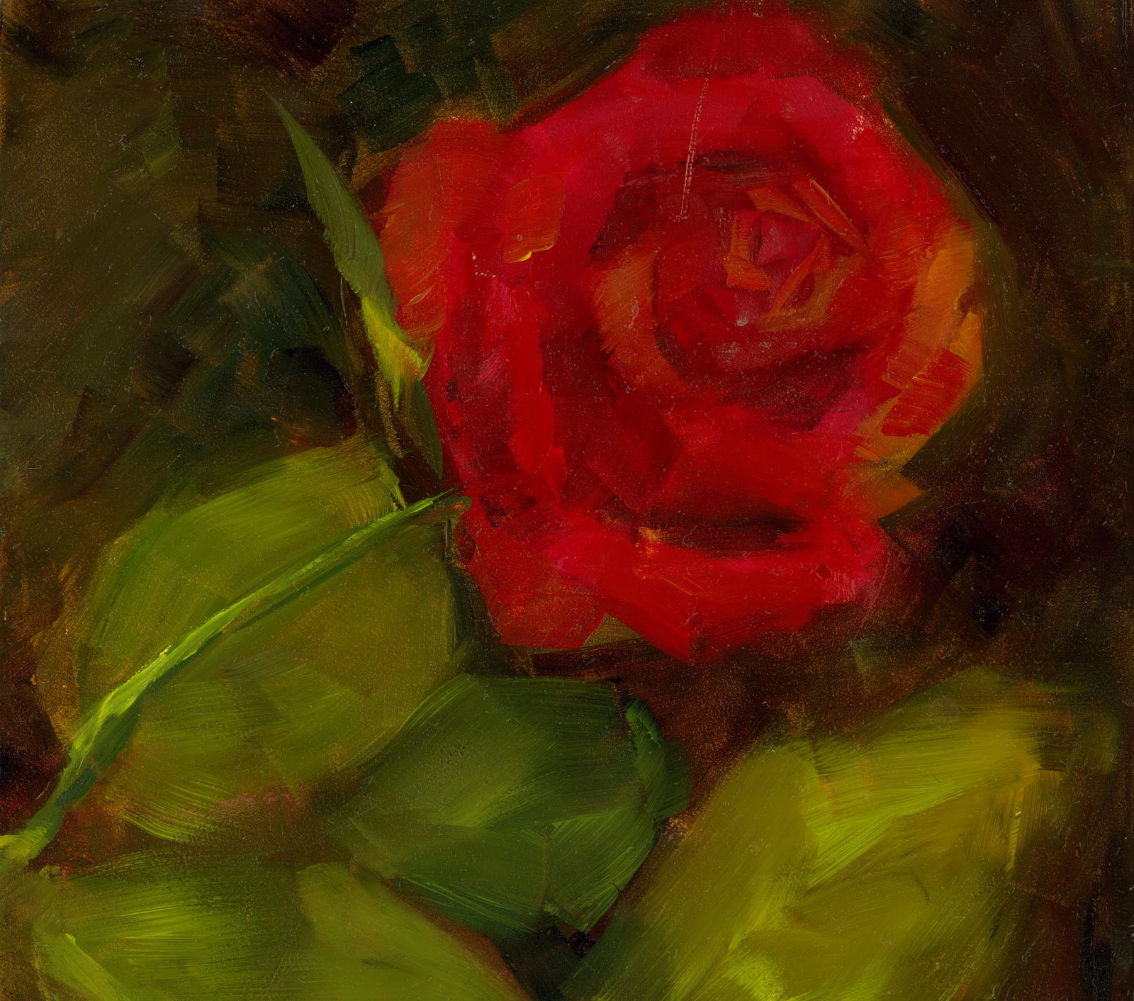
I have discovered a new product that I like, and this painting is the first result after using it. I'll try to get a better picture after it dries: a skill I still haven't mastered.

I have always enjoyed painting oils on paper, but never liked having to do the three layers of gesso (and having to wait for them to dry) before painting on the paper. I did quite a few ACEOs that were oil on paper. Plus I have so much watercolor paper around that I needed to do something with it!
Arches now makes a lovely oil paper that looks and feels like their watercolor paper. Let me tell you: it is great! It feels great, it holds heavier applications of paint, and can take some abuse. The only drawbacks for some folks may be (1) the absorbency, and (2) the inability to completely get back to the white if the paper. If these are issues for you, then it is likely not for you. These are not issues for me though.

I watched a promotional video about it, and the paper is durable enough to roll like loose canvas. Though I haven't painted en plein air with this paper, I can definitely see the potential. It is lightweight and easy to carry, and it isn't expensive at all. One 9x12 pad of 12 sheets is $7.98 at Blick Art. One 22x30 sheet is only $6.44 as you can see here. Arches Oil Paper - BLICK art materials
Now what am I going to do with all that watercolor paper lying around!?
Oil on Arches Oil Paper
9x12


Tuesday, September 9, 2014

"Brewing Storm"

I wasn't sure whether or not to consider this painting "finished" or not.  I suppose it could just be a semi-abstract landscape.  I did, however, like the color scheme which was a pretty limited palette of: Cadmium Red Dark (Classic Artists Oils), Quinacridone Red (Classic Artists Oils), Hansa Yellow Orange (Classic Artists Oils), Cadmium Yellow Medium (Utrecht), French Ultramarine Blue (Winsor & Newton) and Titanium White (Winsor & Newton).

Normally, I would have used Gamblin Galkyd as a medium, but this was a lunch hour painting and all I had were my paints, the board and a palette knife.

I started out with a very thin underpainting (on the land and rock area only) with the Quin. Red and the Hansa Yellow Orange.  Hansa Yellow Orange is like Indian Yellow in other brands, but I particularly like Classic Artists Oils' Hansa Yellow Orange better.  In the dark areas, I used a combination of the Cad. Red. Dark and Fr. Ult. Blue.

The gray in the painting was made from all the colors in the palette scraped together with a bit of white added to get the right value.  I rather like it.


Sunday, September 7, 2014

SOLD - "Baby Blue"

98% of this was done with the palette knife. Since it's a small painting, I had to break out the brush for his beak and eye.


Tuesday, September 2, 2014

Repainting Painting

I revisit paintings a lot.  Maybe it's a comfort thing.  Maybe it's a lazy thing.  I painted these pears from a reference photo from Wetcanvas in pastels (and sold them to a friend).  Thank you, Sandy.  There's a big difference between the oil version and the pastel version though.  Here I was very bold with the colors, and the use of the palette knife brings about quite a different painting.
The pastel version first, and the oil version second:


Tuesday, August 19, 2014

Tomapples

​I've actually painted this scene before, but it was in pastels.  I thought I would give it a shot in oils with the palette knife, because, hey, I must love a challenge.  Boy was it a challenge.  So much of a challenge that my tomatoes look more like apples, so I titled the painting Tomapples.


Wednesday, August 13, 2014

SOLD Zakynthos Cave

I've painted this once before, but it was in pastels and sold it to a repeat customer in Georgia.  Still playing with the palette knives and oils.  The palette knives are so much easier to clean!

6x6
Oil on Cradled Board


Monday, August 11, 2014

The Most Beautiful Village in Provence

Oops!  I forgot the picture when I first posted this!  Roussillon was one of the most beautiful villages in Provence. On our tour through Provence, our lovely guide, Virginia explained that there were quite a few villages boasting to be "The Most Beautiful Village in Provence". I, for one, could not choose. They are all beautiful in so many different ways. Roussillon is very unique with its ochre cliffs. I painted this scene before in pastels, and thought I would give it a shot in oils and with a palette knife. I'm pretty happy with this ... well ... except for that stupid shadow from my easel that I didn't edit out!  Doh!  

I titled this one Ochre Naturel (spelled the French way since this is from Provence)
Ochre Naturel
5x7
Oil on Board

Saturday, August 9, 2014

Pacific Spray - SOLD

It has been many years since I've played with palette knives, and it was quite fun to embark on this journey!
I used Galkyd product by Gamblin to speed up the drying. Hopefully it won't take too long.
8x10
Oil on Board


Sunday, May 4, 2014

Figurative Experiment

I'm getting ready to take a figure drawing class on Saturdays, so I thought I would try my hand at a figure in pastels. I used the same technique that I used in Pynki, the elephant painting I did awhile back. The model is from website that provides virtual models called posespace.


Saturday, January 18, 2014

Transparent Trio

My first pastel still life. The reference photo is from Wetcanvas. The only thing Wetcanvas asks of you when you use the photos is that you credit the owner. I didn't have any real tomatoes, but user Olika posted this gorgeous photo which I used.

Her photo:

There is an app I use to blur photos (versus squinting) to focus on shapes:

My painting:
5 3/4 x 8
Pastel on Schmincke Sansfix. Incidentally, I really like this paper, but it seems impossible to find online in the U.S.


Wednesday, February 20, 2013

Peeking from the Shadow

This is my favorite coffee cup.  The day I painted this, the cup went directly from serving me coffee to serving as a model.


Tuesday, November 13, 2012

Egg Under Easy


Back in May, during Carol Marine's workshop, I photographed most of her still life set-ups.  Last week on my lunch hour, I decided to paint her still life set up featuring a raw egg from my photograph (with her permission).  I have to say that I would have preferred to do this from life because I struggled a bit with getting the colors accurate, particularly the egg "white".  However, this was on my lunch hour, so a photograph was what I had, and a raw egg isn't really something I could set up on my lunch hour!

Here is my photograph of her set up:


Wednesday, October 24, 2012

SOLD - Blood Red

I experimented with several things in this painting.  (1) I used a dark background which is a bit out of the ordinary for me, and (2) I used a new medium by Gamblin called Neo Megilp.  The Neo Megilp gives an incredible shiny finish to the paintings that I am very happy with.  I wasn't quite sure what to name this one, so Blood Red it is!

Also, I have struggled and struggled with getting good photos of my paintings, and I've resorted to scanning them after they have dried until I find another solution.


Tuesday, September 25, 2012

Punta della Dogana (after Maggie Siner) - NOT FOR SALE

I love architecture.  Even more, I love the way Maggie Siner paints the beautiful architecture in Venice and France.  I used Maggie's painting of Punta Della Dogana to guide me for painting semi-abstract architectural structures. I am very happy with the result, and intend to hang this one on my wall and use as a guide for future paintings.

Wednesday, August 29, 2012

Pork Rose

It's been a few weeks since I've posted, and though I was feeling rusty, I painted my first rose and am pretty happy with it.  I thought the rose was going to be more problematic than the pig.  Boy was I surprised!  I had a few titles in mind:  "Pig N Rose", "Rosy Pig", but I am happy with Pork Rose.


Tuesday, June 5, 2012

Swim Charlie Swim! - SOLD


Has anyone out there seen JAWS as many times as I have?  When I set up this little still life, a scene from JAWS popped in my head.  Two guys are trying to catch the shark for the reward and one of them gets pulled into the water with a piece of the pier.  When he starts swimming back to the pier, the guy in the "safety zone" sees the ominous fin behind him and yells "Swim, Charlie, Swim!"  That's what I thought of when I positioned the one cherry so that the "pier" (or boat) is just a knuckle away from safety.


Monday, June 4, 2012

Barbershop Forkette -- SOLD

I was still having fun with forks yesterday, and found four very different types of forks in my silverware drawer. This painting is one of the ones that I have liked the most.  I like the composition and the highlights in blue.

Sunday, June 3, 2012

My Fifth Day at Carol Marine's Workshop

This day was business business business!  I don't have a painting for this day, but  here is a photo of all the paintings that Carol painted for the week.  Drool ... 


We covered everything from how to photograph our wet paintings, getting started with your blog (at least I have a head start there), selling tools, a few things about Photoshop, and more!


I enjoyed this workshop immensely and learned so incredibly much!  Carol is extremely organized and is an excellent teacher.  I loved every minute of it, and it was so sad to say goodbye to my 17 new friends, but I am certain that we will see each other again!

My Third Day at Carol Marine's Workshop

The third day we focused on brushstrokes and composition.  Our exercise was the "no fussing" exercise.  It was one of the few paintings that I actually finished.  Every stroke was a different color even if it was slightly different:  altered with white or grayed down.  It's a great exercise for getting your brain out of the habit of "fussing".  The painting should end up looking like a mosaic.  I had actually tried this exercise from one of the Dailypaintworks Challenges and named my blog Mosaic Hippo as a result since it was the first painting on my blog!

Upon Carol's recommendation, a bunch of us visited the Windrush Gallery in Sedona.  What a visual feast!  Afterwards, a few of us returned to the Sedona Arts Center for some after the workshop painting and a glass of wine.

Carol was gracious enough to paint some glass for us and produced this beautiful morsel.